
White Decorative Objects
White decorative objects can provide a light accent or a clear contrast beside darker surfaces. Start with the intended background, because the same white form may blend on a pale shelf and stand out against dark joinery. Its shape and full scale matter as much as the colour.
Read moreRead less
Compare actual whites with nearby walls and furniture rather than expecting every light finish to match. Then read the material, care and intended use. Sculptures and decorative objects cover the broader focal-form choice. Compare the white relationship with the object’s actual material and finish beside you. Choose the surface after its specific display role is clear.
Showing all 2 resultsSorted by recommended
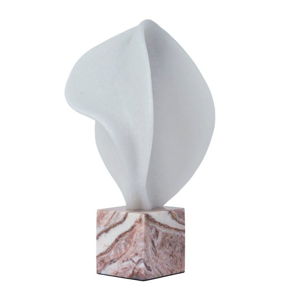
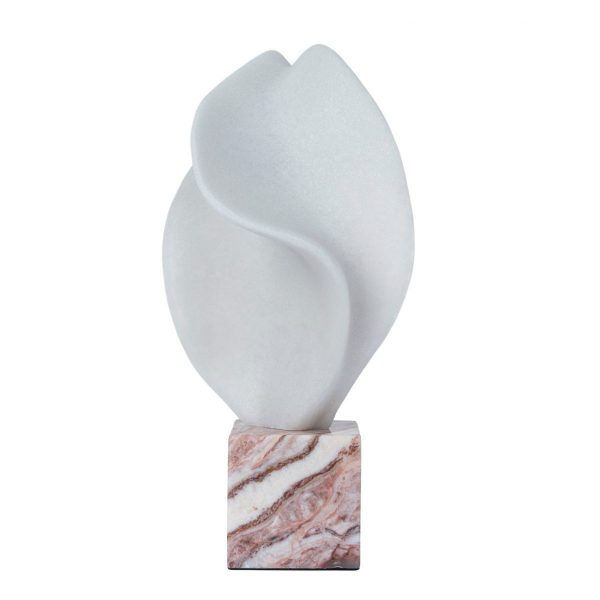
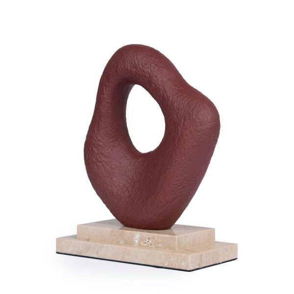

Should the white form blend or become a bright outline?
View the proposed position from the main seat or doorway. A darker background can make a white silhouette stronger, while a pale setting may rely on texture and shadow to separate the form. Decide which effect serves the room.
Measure the complete shape and compare neighbouring objects. A large light surface can become a feature despite a quiet colour name. Black objects provide a different contrast, while beige objects offer a warmer light direction. Keep the display task and scale fixed as you assess those palettes so colour does not become the reason to overlook crowding or practical surface use.
Which white belongs beside existing pale finishes?
Compare the actual tone with wall paint, shelf or tabletop materials and nearby textiles. Warm and cool whites can show differently across those surfaces. A deliberate difference in depth or texture may be more settled than an uncertain attempted match.
Read the material that carries the colour. Ceramic objects and marble objects offer separate construction comparisons when either is your brief. Do not infer them from a white photograph. The useful relationship comes from the actual shade and surface within your room’s light, rather than a fixed assumption that everything described as white will look identical or be maintained the same way.
How will the light accent fit and be handled?
Check full height, width, depth and base against the intended display furniture. A pale appearance does not reduce footprint or establish protective contact. Read placement and any supplied base detail, keeping the form fully on a suitable support.
Follow actual cleaning and handling guidance. Do not assume bleaching, washing or ordinary household sprays are appropriate, or that a vessel silhouette has another practical function. Bookshelf decor preserves access beside books, while coffee table decor keeps low tables useful. White should complete a measured, practical arrangement whose actual material and purpose are understood, rather than remain an undefined bright object added to a crowded surface.
Frequently Asked Questions
Use living room decor to connect the light accent with the wider room view before choosing its final position.