
Brown Decorative Objects
Brown decorative objects can connect a display with timber furniture, earthy textiles or another warm room detail. First decide whether the object should repeat that warmth or add a deeper contrast. A rich brown form has a different presence from a smaller light-toned accent, even when both sit within a neutral palette.
Read moreRead less
Brown is a colour, not proof of wood or another material. Read the actual surface and finish, then compare full dimensions with the intended shelf or table. Natural timber decorative objects provide the separate visible-grain comparison when wood character, rather than brown across materials, is the reason for choosing.
Showing all 2 resultsSorted by recommended
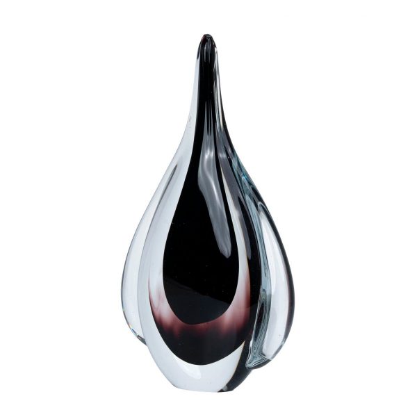


Which warm room detail should the object relate to?
Compare the proposed brown with the nearest timber piece and the textiles around it. Reddish, golden and cooler browns can create different relationships, so a shared warm label is not enough. Decide whether repetition or a clear change in depth serves the view.
Include the background where the object will sit. A darker brown against a pale wall can read as a stronger silhouette; beside similar timber, texture may provide more separation. Beige objects offer a lighter warm-neutral direction, while black decorative objects make another darker comparison. Keep the chosen display task and scale fixed when weighing those palettes.
Does the brown come from grain, colour or another finish?
Read the stated construction rather than inferring material from a photograph. A brown ceramic surface and a timber object have different textures and care, while applied finishes can change how either appears. Identify the actual component that carries the colour.
If wood is central, compare timber decorative objects and verify its construction. If colour is the main need, compare the actual texture and finish alongside the warm room relationship. Look at the full form from the main view, because grain or sheen can be more or less visible across different faces. Accurate details make the warm accent a considered choice rather than a material guess.
How can a deeper accent avoid making the display crowded?
Measure the full outline and base, then compare it with surrounding objects and the supporting surface. One brown focal shape may provide enough colour depth without repeating several similar pieces. Leave space for its form to be understood.
Keep everyday use practical. Coffee table decor focuses on a low surface that still needs room for drinks and movement; bookshelf decor keeps book access central. Read placement, base protection and care for the actual object. A warm accent should resolve a particular view while leaving clear space on a surface used for something else.
Frequently Asked Questions
Explore ceramic decorative objects when the next decision concerns the stated surface rather than warm colour.