
Grey Vases
Grey vases can link a display with stone, textiles or quieter wall colours, while leaving stems as the main colour. Compare the actual grey rather than treat it as a neutral that matches everything. Warm brown influences and cooler blue influences create different relationships with the room.
Read moreRead less
Decide how clearly the vessel should stand apart from its background. A similar tone can work when the shape or texture remains deliberate; an accidental near-match may make the form less clear. Include the planned stems and useful opening while comparing that neutral relationship, then mark the full silhouette on the furniture. Browse any listed pieces by their actual finish, or explore vases and decorative pots to settle the intended contents before choosing a grey palette.
Showing the single result
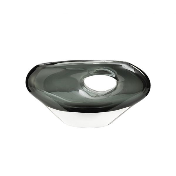
Choose grey warmth against the real background
Use the wall and furniture surface together as references. A warm grey vessel can look quite different beside a cooler grey wall, even though both seem quiet alone. Compare the actual shades with the stems or permitted contents too.
Choose an intentional step in lightness when a clearer outline is useful. The beige vase guide helps compare a warmer neutral alternative without assuming either colour family suits every room. Keep the complete vessel in view, including any differently finished base or edge. Grey is a relationship within the actual display rather than a promise of an easy match with all nearby stone and fabric tones.
Make the neutral form deliberate
Look at the opening, shoulders and base as a silhouette. A shaped neck or defined body can give a neutral vessel presence without introducing another strong room colour. Assess actual surface texture rather than infer a matte or stone-like finish from grey.
Measure the full display on its intended furniture, including any stems. The tabletop vase guide helps where daily tasks and nearby views need space. Choose a form that is useful for the contents as well as clear against the background. A quiet tone should not require an oversized body or a crowded surface simply to make the decorative object visible across the room.
Separate colour choice from material function
Read the actual vessel material, interior and care. A grey appearance does not establish stone, ceramic, glass or a sealed surface. Confirm water-holding suitability where fresh flowers are intended, and any supplied insert rather than planning it from the shape.
If material pattern is central to the display, compare marble vases using their actual specification and finish. Choose the grey vase through undertone, form and verified use together. The restrained palette can support a calm arrangement, while the real opening and care determine whether that arrangement remains practical to set up and refresh in the room you have chosen.