
Beige Vases
Beige vases can give an arrangement a warm neutral base without becoming its strongest colour. Compare the actual beige with the wall, furniture and stems you plan to use. Creamy, sandy and pink-influenced tones can create different relationships, even when each vessel is described broadly as beige.
Read moreRead less
Decide whether the vase should blend gently or remain clearly outlined against the surface behind it. Texture and shape become especially useful when the colour is quiet. Compare the beige with the complete arrangement, then check that the opening and allowed contents suit what you want to display. Browse any listed pieces by their real finish information, or review vases and decorative pots to choose the vessel’s purpose before narrowing the warm neutral palette.
Showing the single result
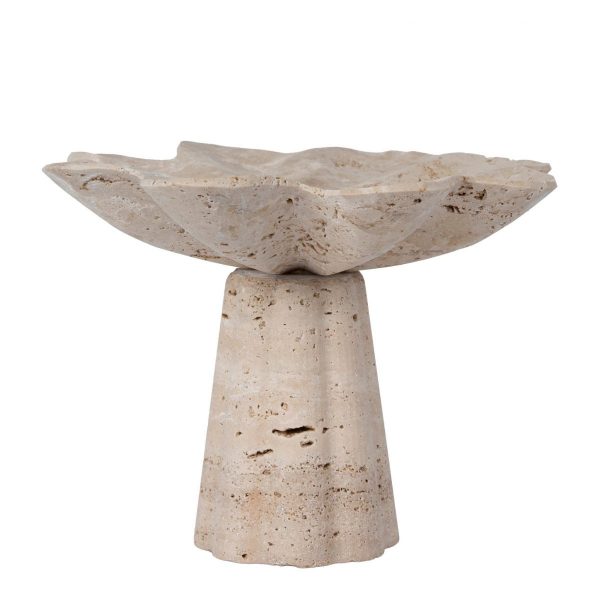
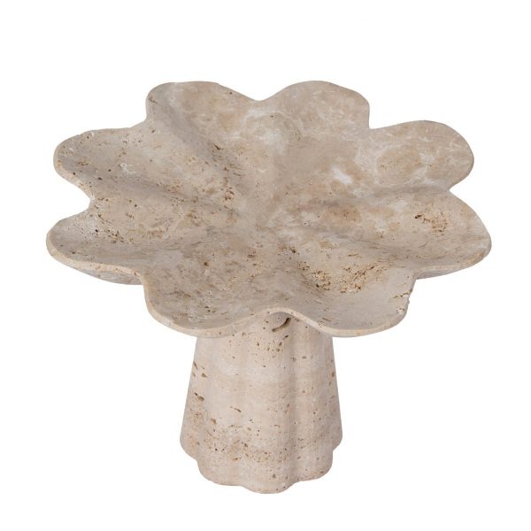
Choose warm neutrality with enough separation
Use the actual wall and furniture finish as references. A beige vessel against a similar pale surface may need a different lightness or texture to remain distinct. Decide whether that soft relationship is the intended result or whether a clearer outline would be more useful.
Compare the vase with the complete planned arrangement, including stems or permitted dry contents. Colour that looks neutral alone can become a visible warm step beside cool greenery or a bright flower. Look at grey vases when a cooler neutral relationship is also being considered. Choose based on these actual neighbours rather than treat beige as a match for every light room.
Let shape and surface carry the quiet colour
Read the opening, body and base dimensions together. A wider shoulder or narrower neck can create an identifiable outline even when the vessel is close in tone to the wall. Compare the actual texture and finish information rather than infer a rough or smooth face from beige.
Mark the silhouette on the intended surface, including any arrangement above it. The tabletop vase guide helps test that outline near everyday tasks. Choose shape with the viewing position in mind, so a quiet vessel remains deliberate without taking extra surface space solely to make its neutral colour visible from across the room.
Keep contents and care clear beneath the palette
Confirm the selected vessel’s allowed contents and water-holding use where fresh flowers are planned. Beige does not establish ceramic, stone, a sealed interior or any cleaning method. Read the actual material and finish rather than attach those facts to a colour.
If several neutral objects share the surface, compare their real base sizes and openings before adding another. The vases and pots guide helps organise a group around different useful forms. Choose the beige vase when its warmth, silhouette and actual function all belong to that display, rather than rely on a neutral label to settle material performance or room scale.