
Grey Side Tables
Grey side tables can make a considered neutral link beside seating, but the actual grey needs a room reference. Compare its undertone and depth with upholstery, floor and wall. A grey that feels warmer beside one surface may look different next to another neutral.
Read moreRead less
Texture and full form help decide whether the table should blend or stand apart. Then check useful top area and reach from the actual seat. Side tables cover those first practical comparisons. Use the full table view to compare the grey with your room, and check the actual surface care before choosing.
Showing all 7 resultsSorted by recommended
-
On SaleOriginal price was: $399.00.$351.00Current price is: $351.00.
-
-
On SaleOriginal price was: $552.00.$486.00Current price is: $486.00.
-
-
-
-
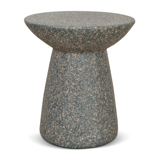

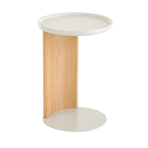
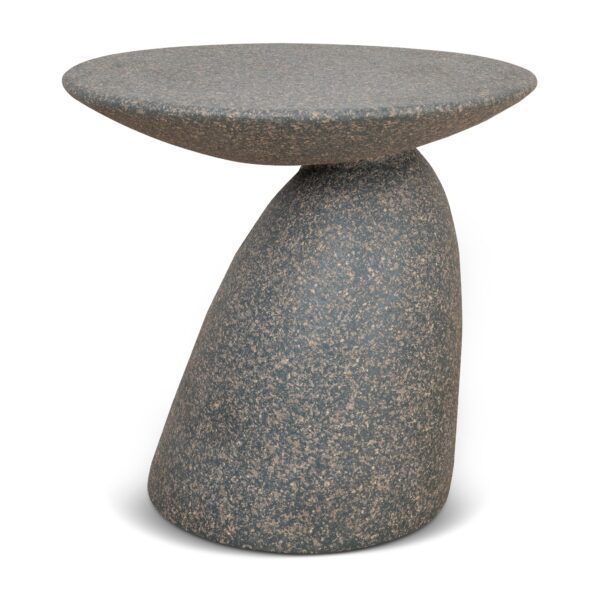
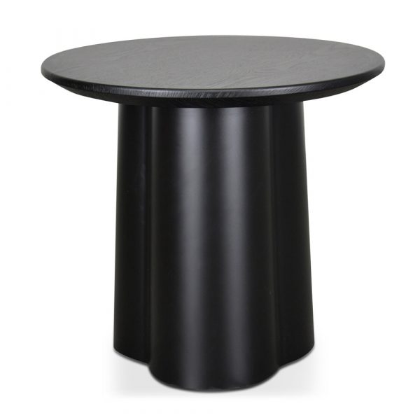
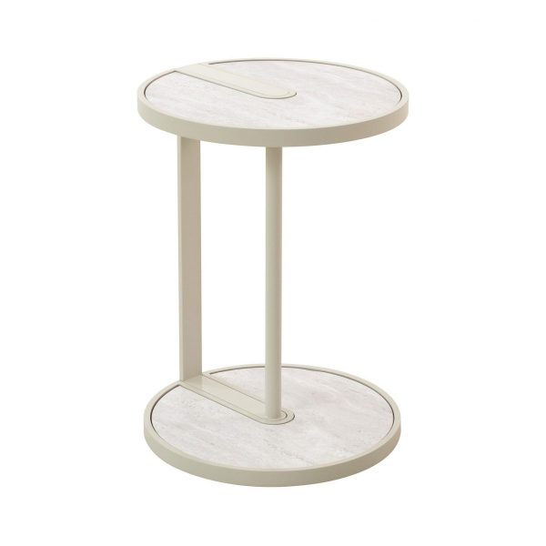
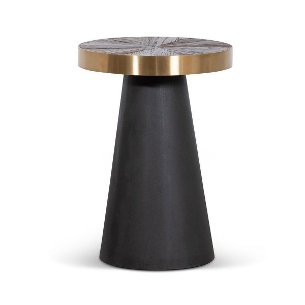
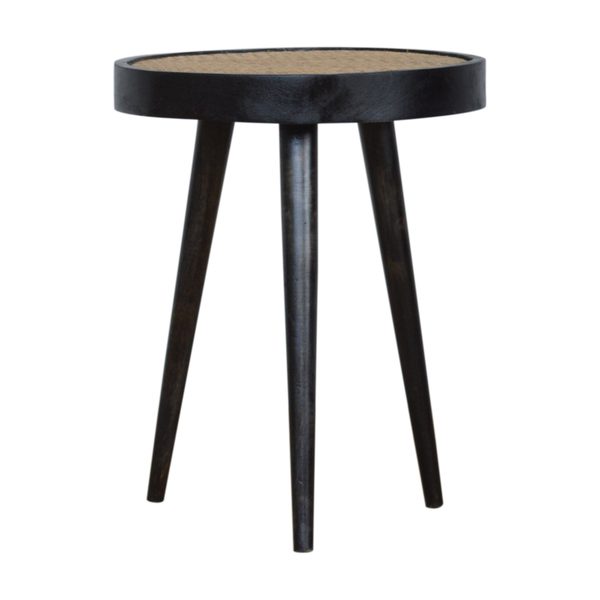
Should grey repeat the upholstery or give it separation?
Compare the proposed finish directly with the seat and the largest nearby neutral surface. A close but uncertain match may be less deliberate than a clearer difference in depth. Look for any warm or cool cast rather than use the shared colour name alone.
Assess the complete table with its everyday objects. Black tables offer a more definite dark outline, while ivory tables provide a warmer pale direction. Keep the useful top and seated position fixed while comparing those palettes. The grey should have one clear relationship in the room instead of being selected as a universal background for every other neutral.
What texture gives the small neutral form definition?
Read where grey appears and how each surface is finished. A smooth coating, textured covering or another stated material can show the shade differently. The colour should not establish concrete, fabric or one underlying construction by itself.
Look at the base as well as the top beside the floor and seating. A quieter form may support busy upholstery, while a clearer texture can define a plainer setting. Choose the actual full table rather than add accessories to rescue an unclear near-match. Once useful dimensions work, one deliberate material relationship can give the grey a role without making the seat-side area visually crowded.
Can the neutral surface remain useful when the seat is occupied?
Measure top height, practical area and full base with the chair or sofa in use. Include room to place a drink beside a lamp and to rise without catching a projection. A quiet-looking finish does not reduce actual floor space.
Read materials, use and loading separately from appearance. Follow the chosen coating’s care for ordinary contact rather than assume grey hides marks. Sofa tables refine a particular seat relationship, while tables with shelves provide a below-top organisation comparison. Choose the neutral link on furniture whose surface, access and care serve the room, with texture completing those practical facts.
Frequently Asked Questions
Use white tables when a lighter contrast is the next colour question after reach and surface requirements are clear.