
Grey Ottomans
Grey ottomans can connect seating with different nearby textiles, but neutral does not mean without an undertone. Compare the actual grey with the sofa, chair and rug: warmer shades and cooler greys can make those relationships feel different.
Read moreRead less
Give the low piece a clear role and edge against the floor. A near-match may look quieter while making the form less visually distinct, and the actual footprint remains unchanged. This guide helps keep palette and function together. Browse any listed pieces with the complete seating scene in mind, or explore the wider ottomans and footstools category when height, top area and intended use should be chosen before the neutral covering.
Showing all 3 resultsSorted by recommended
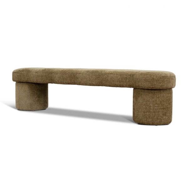

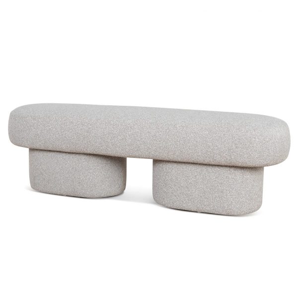
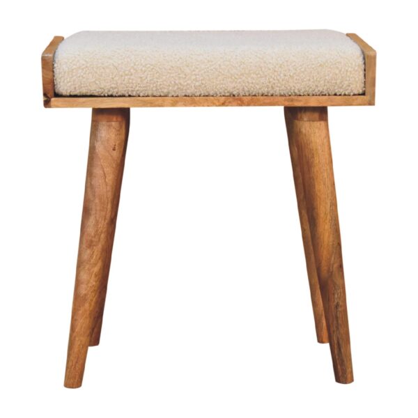
Choose grey as a deliberate link between textiles
Use the largest upholstery and rug surfaces as references. A warm grey can relate differently to beige cloth or timber from a cool grey. Compare actual shade and texture instead of expecting all neutral finishes to join automatically.
Decide whether the ottoman should sit clearly lighter or darker than the rug, or blend more closely. A clear step can give the low object its place without decorative accessories. If a warmer companion is wanted, review beige ottomans through real finishes. Choose a palette relationship over the full object, not a close-up colour sample assumed suitable for every combination of chairs and sofa covers.
Keep the quiet piece physically useful
Read actual height, top size and supported functions. Grey colour cannot establish foot support, extra seating or table use. Choose the geometry for the main role and compare with the real seat and preferred resting position.
Map the complete low object with occupied seating and nearby table access. A neutral finish can reduce visual prominence without reducing the room space it uses. Compare round ottomans for a circular outline, keeping diameter and usable top separate. The companion should remain reachable and easy to move around, rather than be accepted as a quiet shape where its actual position interrupts an everyday route.
Check the grey covering and base materials
Check covering and any different base components, including actual support beneath the top. A grey fabric-like image does not identify fibre composition, padding or resistance to marks. Follow the selected item’s care for its intended contact.
If a textile preference is the main purpose, compare fabric ottomans with material details in view. Keep accessories within actual use guidance and clear enough for routine care. Confirm assembly and handling.